Checkout Flow Redesign
For Project Management Institute
I served as a UX/UI designer on a team that consisted of another UX designer, a product owner, a project manager and a development lead to enhance the checkout flow on our site, including the Cart page, Checkout page, Order Review and Confirmation page. We utilized eCommerce best practices, competitor analysis, customer insights, data and user research to design the enhanced checkout flow.
My Role
Competitor Analysis: Completed a competitor analysis of other checkout flows
UX Design: Worked along side another UX designer during the lo-fi phase
User Research: Conducted unmoderated user testing through usertesting.com
UI Design: Designed hi-fi mockups utilizing a design system to ensure we are providing a consistent digital experience to our customers. The deliverables included 60+ mockups (including desktop, tablet and mobile views) and 5 interactive prototypes.
Developer Handoff and Communication: Created annotated mockups for developers. Worked alongside a product owner to present designs to developers.
Results
57%
Decrease in web, UI and tech issues
50%
Decrease in promo code and voucher confusion
90%
Decrease in “won’t load” customer issues
Enhanced the user interface by implementing a clean and intuitive design that prioritizes information, making it easily accessible and reduces cognitive load. A focus was placed on creating a visual consistency between the pages in the checkout flow. We streamlined the checkout process by reducing the number of steps and minimizing user effort.
Overall Enhancements
Checkout Page
The Checkout page now provides a clear step-by-step process that establishes purposeful focal points, guiding the user through each task.
Order Review
The order review page allows users to double check all information entered before moving forward with their purchase.
Confirmation page
The Confirmation page now follows a consistent layout with the other checkout pages. Users can quickly scan the page to see the products they purchased, total cost, and payment method. Research showed that users had difficulty accessing digital products after purchase. In the new design, there is a section for users to access their items and a primary CTA that takes them directly to their newly purchased product.
Mobile Mockups
Priority given to creating seamless and user-friendly experience on mobile devices.
A sticky primary call-to-action button was implemented that is always present while scrolling through the page on a mobile device.
A stick order summary module was also added to the mobile view. Users can open and close this accordion module to see their full order summary.
Shopping Cart
Checkout Page - Scroll View
Select Features
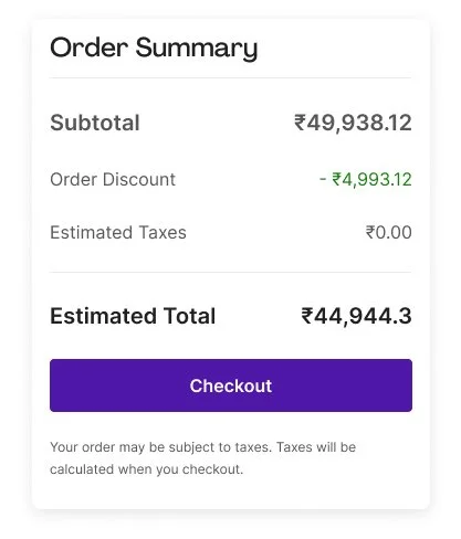
The design needed to account for extra characters needed when displaying prices in local currencies, ensuring the design remains user-friendly across regions.
Local Currency
Promo Code
User research indicated that users experienced confusion around the usage of promo codes. The new design approach takes the findings into consideration and ensures that the promo code and its corresponding products are prominently featured resulting in enhanced clarity and a more seamless user experience.
Loading State
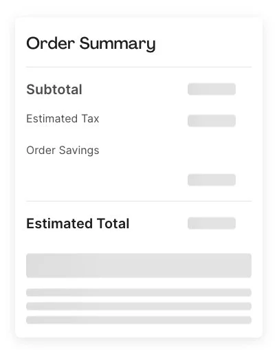
User research indicated a high number of won’t load errors from customers. One of the ways we addressed this was to introduce clear loading states.


